Luna Charclay
Skincare Package Design
This project was to create 3 skincare product designs. The client’s idea was for each product to have a
stand-alone design but somehow be unified. To obtain this, I decided to use the same color scheme and
font so when those products are on a shelf, it looks like the same product line even if the designs are
different.
YEAR
2019
ROLE
Design
TOOLS
Illustrator, Photoshop
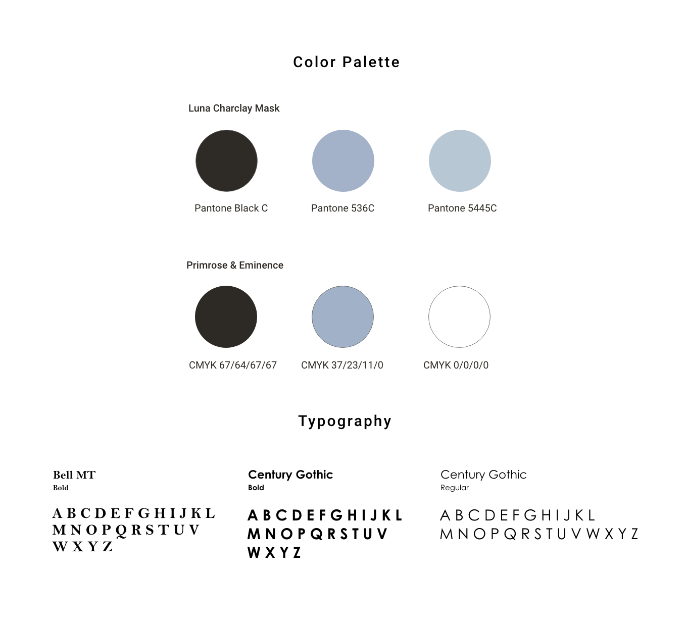
Color Scheme and Typography
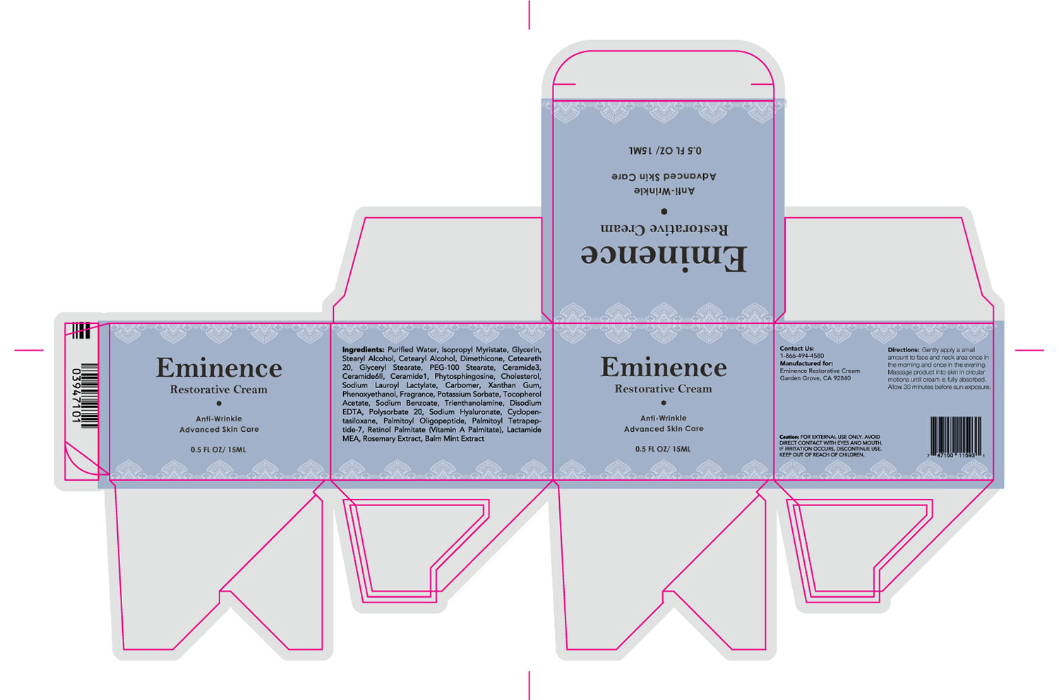
Luna Clarclay was printed at a different printing place, so solid coated Pantone Color was required. Primrose and Eminence are the CMYK color codes used. The product name typeface was Bell MT font which gives a classic urban style. The product description typography is Century Gothic which added to the modern pop feel to the design.
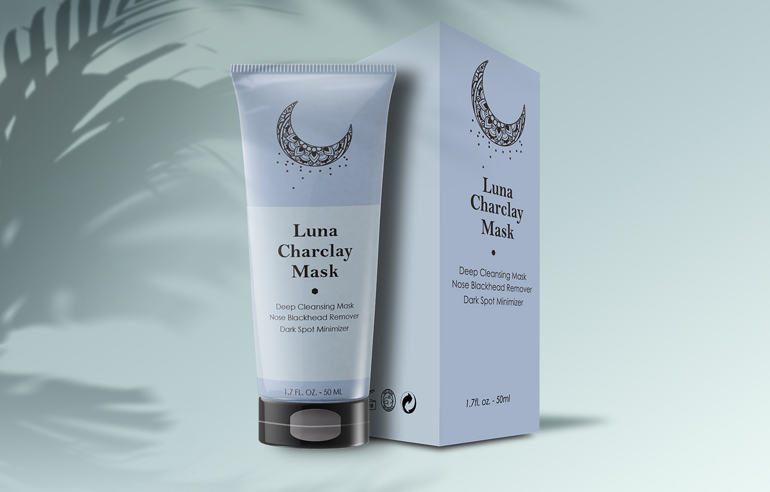
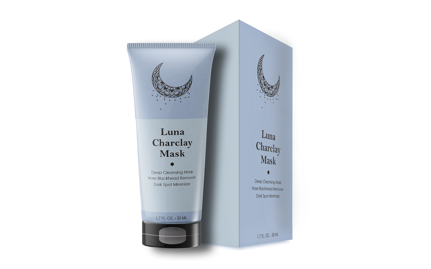
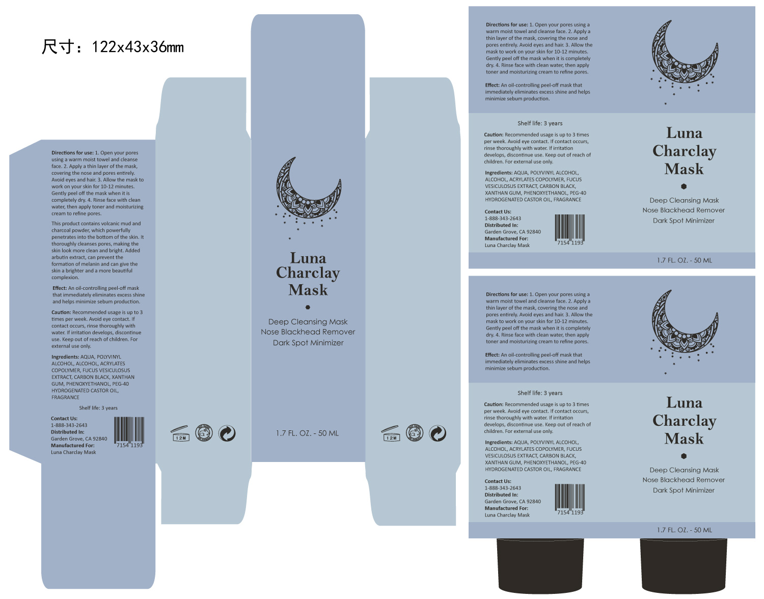
Luna Charclay Mask
The design was started from Luna Charclay Mask. This design idea came from the name of Luna. I started brainstorming the different types of moon objects and came up with this Arabic style crescent moon. The text was set to black to match the black tube cap.
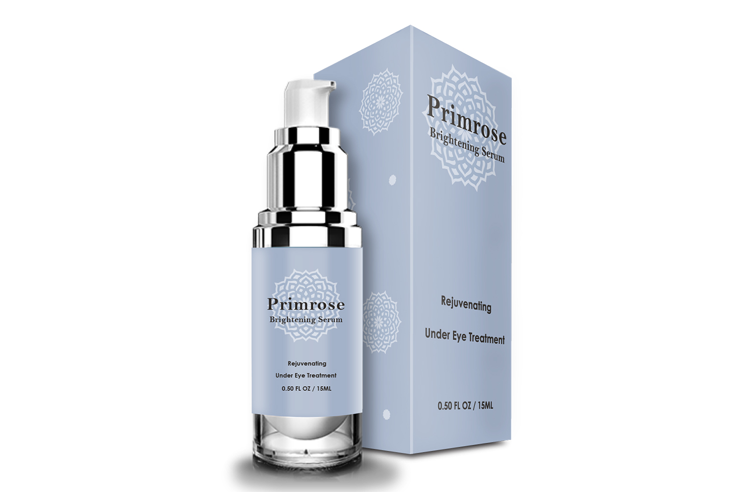
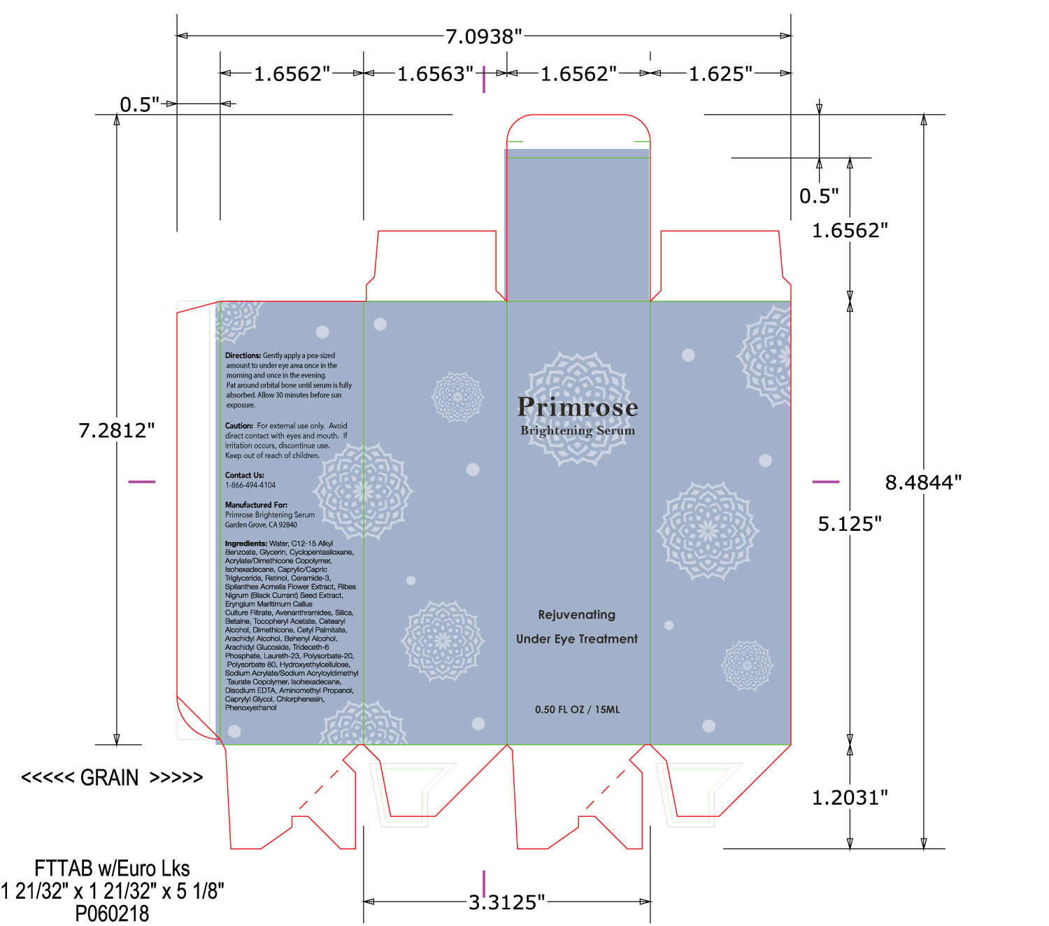
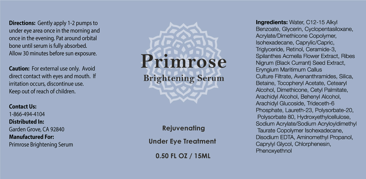
Primrose
Primrose flower represents youth, new beginnings, and their beauty. My idea was to use the Arabic stylized flower element to remind the customer of primrose. For the front of the box package, the focal point is the product name, therefore I used white flower elements to try not to distract from the focal point. The side of the package is playful, a few different sizes of flower describe blooming beauty.
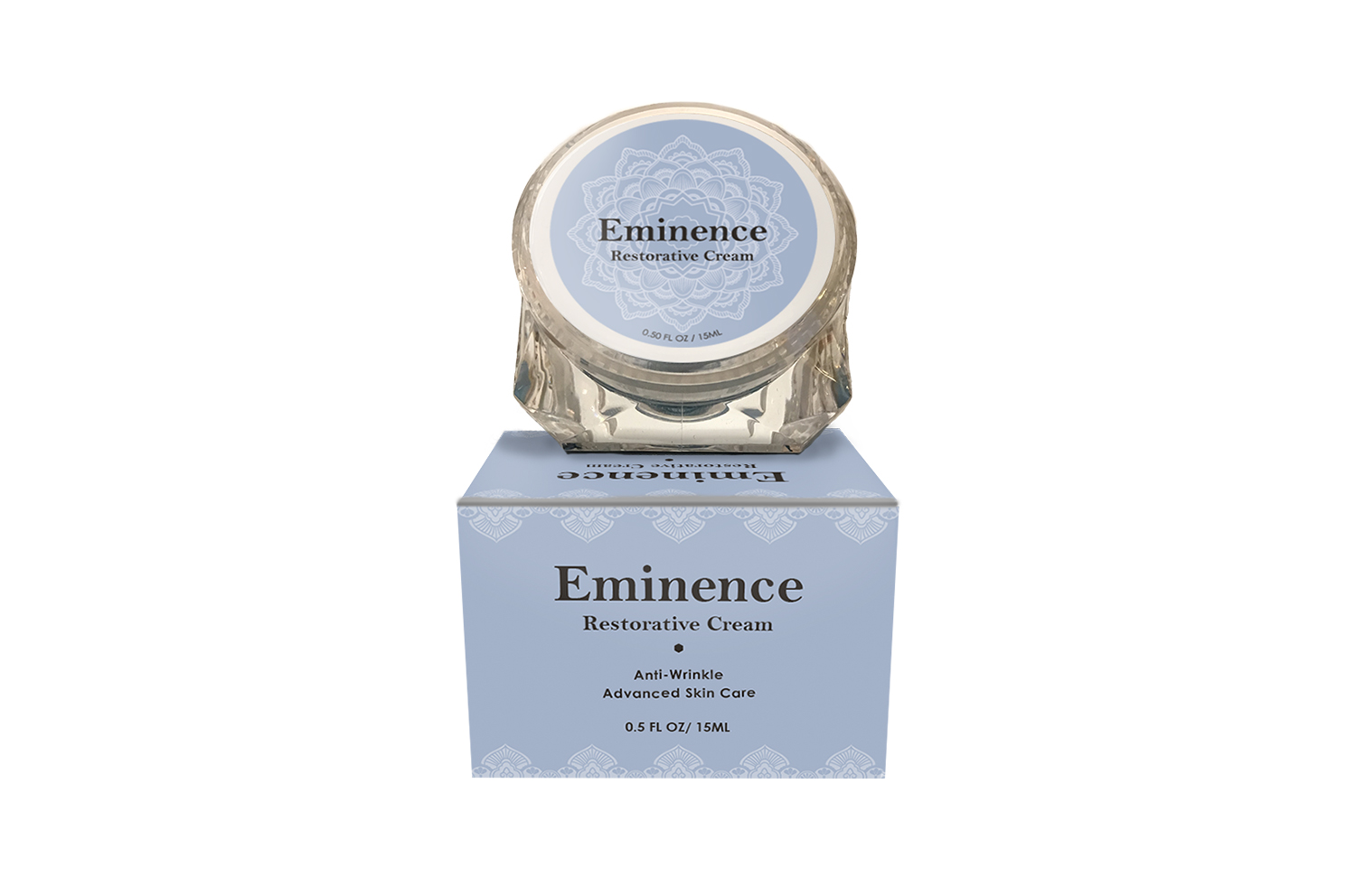
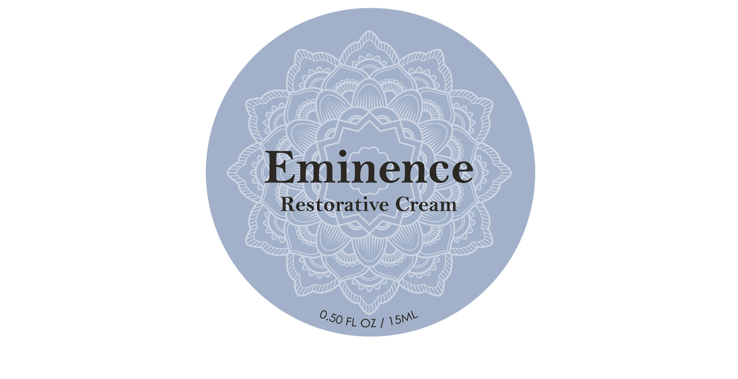
Eminence
The meaning of Eminence is superiority. The main challenge for this design was to match the name and unify the style with other products. I continued to use the Arabic style for the label and box. The flower design on the label is made for a little surprise ;) When a customer opens the box, a flower is sitting in a box like a little bouquet.